Let us help keep you on the cutting edge of website design with our list of the biggest website design trends for 2016.
An important part of effective website design is keeping on top of technology and trends to stay relevant so visitors remain interested. Adding dynamism to form and function is necessary but not always the easiest task. Staying up-to-date with new trends and developments is a full time job for web developers but is also part of what makes their job so important. The focus for design trends is enhancing the user experience through simple, accessible and responsive web design. Check out our list of 8 website design trends that are going to play a big role in 2016.
#1 – Captivating Imagery
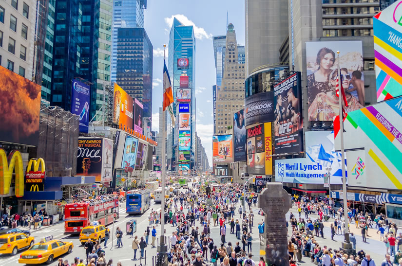
Using a captivating image on a website landing page can grab a visitors attention. Choose your image correctly and visitors will feel inspired by the visual and can mean extra conversions for your business. You’re also creating and reinforcing your brand image simultaneously. Technology is now at a point where an image shouldn’t affect your load time, so it makes sense to appeal to the visual sense.
#2 – Typography
With the trend of minimal design continuing, typefaces are front and center in website designs. Use typography to create a dramatic impact and display your message boldly. For 2016, look for typefaces to flatten out even more and lose all the artistic edges and flourishes. Choosing a sans-serif font helps keep fonts sizes small for the sake of website responsiveness and keeps typefaces easy to read on small mobile device screens.
#3 – Use of Background Video
Adding a new dimension to your homepage through background video is a relatively new trend and one that will surely continue. A background animation can greatly enhance a pages appeal if done discreetly so that it blends with the rest of the page content. Think, “gentle” when adding video or animation so that the viewer is not distracted.
#4 – Google Material Design
The Google style language “Material Design” makes it possible to add depth to your website design through grid-based layouts, animations and the use of light and shadows. Material Design offers subtle design changes that can really make your page pop. Material design also adds an element of depth to the flat designs to keep things fresh. Flat design makes for functional, fast loading pages that have a minimalistic nature. This is key to making websites easy to read and function smoothly on mobile devices.
#5 – Single Page Scrolling
Utilizing single pages that feature long scroll navigation allow for a lot of information to be contained in a single URL. This makes it effective for delivering messages to visitors and keeping the page extremely mobile friendly. Repetitive page loading is also eliminated allowing content to rule. The drawback is that long scroll pages sometimes make it hard to find the content you are looking for and bounce rates are sometimes increased. Taking care to look at the nature of your brand and its audience will give you clues as to whether or not long scroll is right for you.
#6 – Two-tone Color
Using duotone color pallets incorporated into a minimalist design generates visual impact that vibes with viewers without making a design seem confused. This simple way to add some spice to your design will continue to gain traction in 2016.
#7 – Employ Hover Animation
Add utility and function to your website without distracting from your design with hover animations. If a viewer is unsure of what an elements function is, they can hover their mouse over it to display a pop-up box that offers an explanation. This keeps the viewer experience smooth and uninterrupted. Keep your animations subtle and inline with your other design elements for the best effect.
#8 – No More Stock Photography
Users are starting to shun stock photography. Mostly the scenes stock photography depicts look fake and uninspiring so users are demanding something better. The key for website designers is to use images that are designed for the site and feel as if they offer a personal connection. There are lots of options to use instead of stock photography such as cartoons, animations, info graphics, videos, GIF’s or just photography taken specifically for your brand. The same advice goes for icons, where the extra touch can really make your site stand out from the competition.
Creating a site that is designed to only look nice is not the way to go. Users expect your site to be functional and easy to use, meaning they will leave if their demands are not met. Users are now very aware of what a well designed website is made of and know when something is amiss. This is especially important for e-commerce websites that live and die by their conversion rates. Ensure your site functions as well as it looks and enjoy the benefits of advanced website design in 2016.


